
Rooder Story
In 2014, a designer named Li Qingjian embarked on a journey to build a brand rooted in gratitude and a customer-first philosophy. The name "ROODER" itself carries a special meaning—it was inspired by Li’s very first client, a gesture of appreciation for the trust and partnership that laid the foundation for his dream.
On July 17, 2014, Li began crafting a logo that would visually represent the spirit of ROODER. After four rounds of refinement, the final design was completed on September 17, 2014, in Shenzhen, China. Every element of the logo was meticulously hand-drawn and later digitized, reflecting both creativity and precision.

At the heart of the design are the two "O"s in "ROODER," reimagined as the front and rear wheels of an electric vehicle. The outer rings symbolize tires, while the inner circles consist of nine uniquely arranged rectangular spokes. Each spoke is distinct, representing the diverse strengths and qualities of ROODER’s partners. Together, they form a cohesive wheel—just as collaboration and mutual respect drive long-term success. The number nine, combined with the circular shape, also symbolizes a journey: from nothing to something, from small to strong, and from local to global.
The rest of the letters in "ROODER" were carefully stylized to convey strength, modernity, and innovation. The result is a logo that not only reflects the company’s core products—electric vehicles—but also embodies its mission: to drive the future with integrity, collaboration, and a relentless focus on customer satisfaction.
ROODER is more than a brand. It’s a promise to every client and partner: together, we move forward.
Electric Bikes & Scooters EU Stock, 3-9 Day Free Delivery to Door.
-
Electric Bicycle Shengmilo s600 Dual Motor 26 Inch EU CE for Sale
 Electric Bicycle Shengmilo s600 Dual Motor 26 Inch EU CE for Sale
- Prix normal
-
€1.299,00 - Prix normal
-
€2.142,00 - Prix de vente
-
€1.299,00
Vue rapide
-
110KM Long Range Off Road Electric Bike 60V 30A 45-65km/h for Sale
 110KM Long Range Off Road Electric Bike 60V 30A 45-65km/h for Sale
- Prix normal
-
€1.698,00 - Prix normal
-
€2.399,00 - Prix de vente
-
€1.698,00
Vue rapide
-
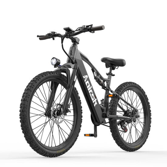
Electric Mountain Bike for Adults 468WH 250W 25KM/H EU CE for Sale
 Electric Mountain Bike for Adults 468WH 250W 25KM/H EU CE for Sale
- Prix normal
-
€678,00 - Prix normal
-
€848,00 - Prix de vente
-
€678,00
Vue rapide
-
Electric Bike 26 inch Front Suspension 250W 25KM/H 30-55KM for Sale
 Electric Bike 26 inch Front Suspension 250W 25KM/H 30-55KM for Sale
- Prix normal
-
€578,00 - Prix normal
-
€747,00 - Prix de vente
-
€578,00
Vue rapide
-
Electric Mountain Bike for Adults Full Suspension NFC Lock 100KM Range
 Electric Mountain Bike for Adults Full Suspension NFC Lock 100KM Range
- Prix normal
-
€778,00 - Prix normal
-
€972,00 - Prix de vente
-
€778,00
Vue rapide
-
20" Fat Tire E-Bike | 48V 15Ah | NFC Start | 25/45 km/h CE for Sale
 20" Fat Tire E-Bike | 48V 15Ah | NFC Start | 25/45 km/h CE for Sale
- Prix normal
-
€832,00 - Prix normal
-
€1.125,00 - Prix de vente
-
€832,00
Vue rapide
-
Electric Bike for Women 250w 25km/h NFC Lock for Sale
 Electric Bike for Women 250w 25km/h NFC Lock for Sale
- Prix normal
-
€678,00 - Prix normal
-
€848,00 - Prix de vente
-
€678,00
Vue rapide
-
Rooder MX1 26" Electric Mountain Bike 48V 250W 25KM/H CE EU for Sale
 Rooder MX1 26" Electric Mountain Bike 48V 250W 25KM/H CE EU for Sale
- Prix normal
-
€1.159,00 - Prix normal
-
€1.699,00 - Prix de vente
-
€1.159,00
Vue rapide
-
Tricycle Cargo Ebike 3 Wheel Electric City Bike 36V 15A for Sale
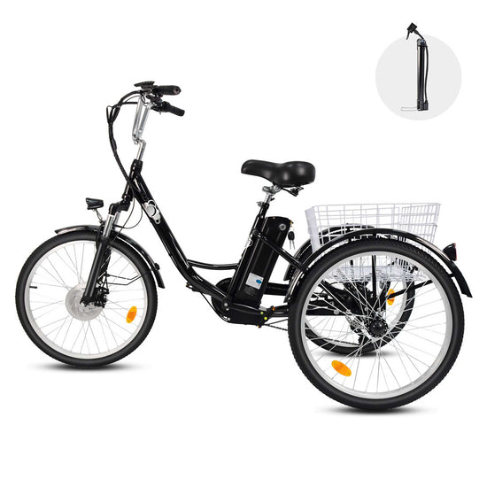 Tricycle Cargo Ebike 3 Wheel Electric City Bike 36V 15A for Sale
- Prix normal
-
€879,00 - Prix normal
-
€1.255,00 - Prix de vente
-
€879,00
Vue rapide
-
Rooder Mangosteen Super M1 Elektroroller Chopper Scooter for Sale
 Rooder Mangosteen Super M1 Elektroroller Chopper Scooter for Sale
- Prix normal
-
€830,00 €1.645,00 - Prix normal
-
€2.435,00 - Prix de vente
-
€830,00 €1.645,00
Vue rapide
-
Rooder Mangosteen Alligator M2 Electric Scooter e Roller 3000w 40ah
 Rooder Mangosteen Alligator M2 Electric Scooter e Roller 3000w 40ah
- Prix normal
-
€1.999,00 - Prix normal
-
€3.119,00 - Prix de vente
-
€1.999,00
Vue rapide
-
3 Wheel Electric Scooter Fat Tire Citycoco Trike 60V 40AH EEC COC
 3 Wheel Electric Scooter Fat Tire Citycoco Trike 60V 40AH EEC COC
- Prix normal
-
€1.799,00 - Prix normal
-
€2.249,00 - Prix de vente
-
€1.799,00
Vue rapide


